Impact
user satisfaction with the new approver view
Post-launch survey
approver interviews across 5 customer organizations, plus a survey sent to 40 customers. Every insight became a fix: first-visit guidance, a context side panel and a next-task list.
3 of 3 insights shipped
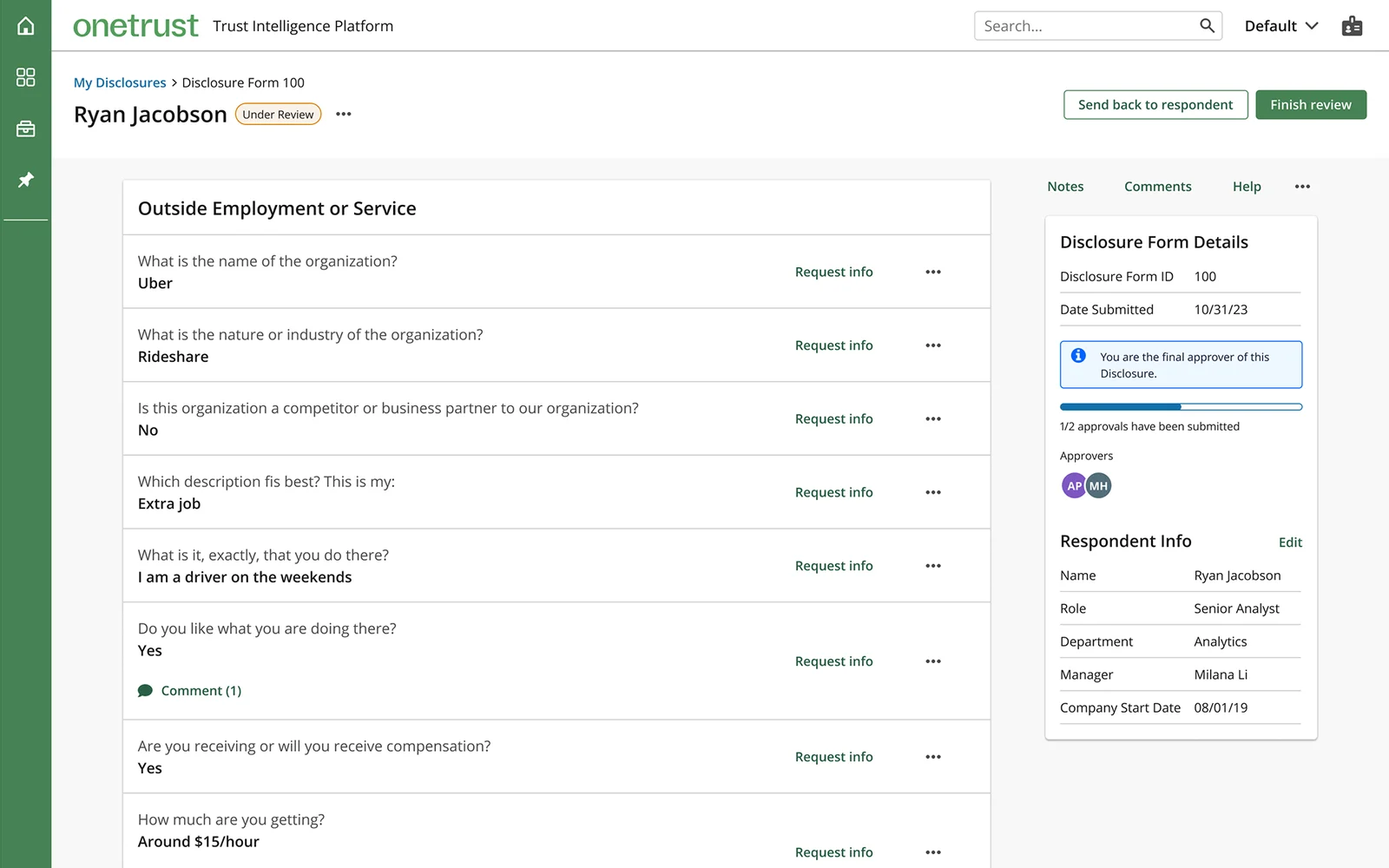
- Separated the approver and respondent views, so approvers only see what they act on
- Added guidance and a next-task list for people who review once or twice a year
- Kept product and engineering aligned when customer research stalled
Overview
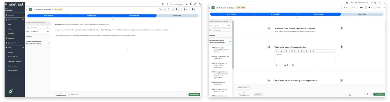
Approvers used the same screens as the employees filling forms out.
Led research and design for a dedicated approver view.
90% satisfaction after launch. Shipped on time.
2 designers, researcher, 2 PMs, 2 eng leads. 3 months.
The problem
One screen, two different jobs.
Employees answer ethics questions; approvers review and approve or send back. Both used one interface.
“When there are so many things to look at, they can lose sight of the most important things.”Interview participant
Research
Talk to approvers, then test the fix.
11 interviews across 5 customer organizations, plus a survey sent to 40 customers. When responses slowed over the holidays, I shifted to technical discovery with PMs and engineering to keep the sprint moving.

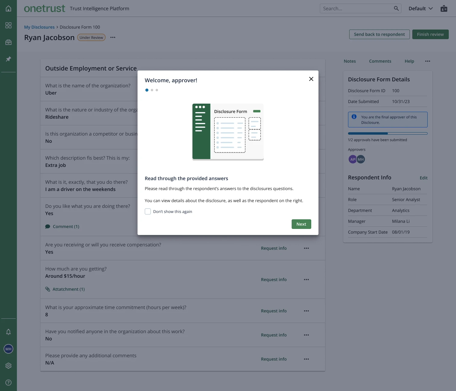
Finding 1 · Infrequent users get lost
Guide them in.
Many approvers review once or twice a year.
A tip modal they can turn off; respondent-only features removed.
Finding 2 · Context lives elsewhere
Bring context to the review.
Approvers left the platform to look things up.
A side panel with HR data and disclosure history.
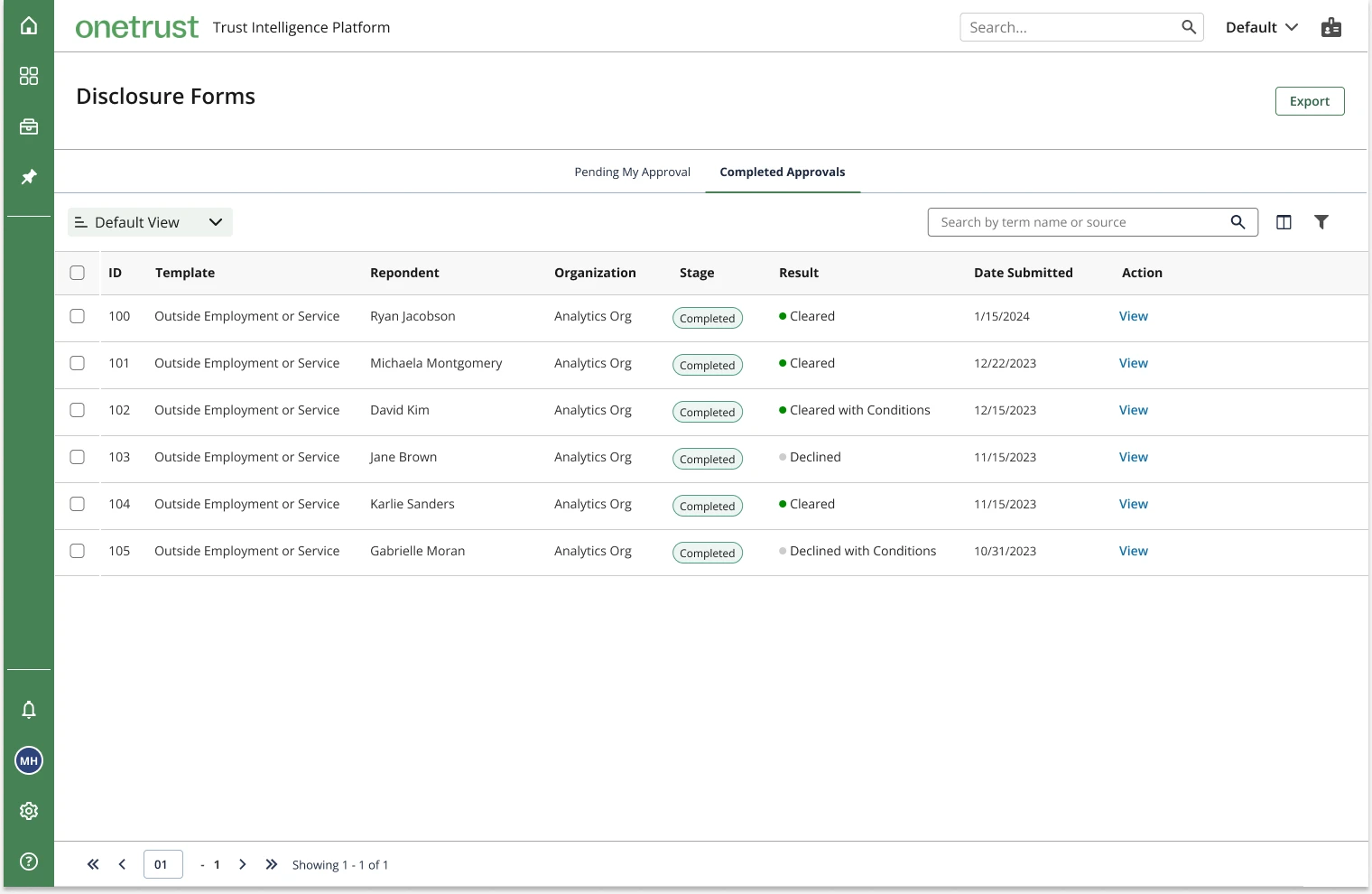
Finding 3 · “Now what?”
Always show the next task.
After submitting, approvers didn’t know what was next.
Redirect to a prioritized task list.
The pivot · Text over charts
Accuracy beat visualization.
A dense, structured text layout.
The planned data-viz dashboard.
Approvers valued accuracy; the design system had no flexible charts.
Less at-a-glance summary; ~2 sprints saved.
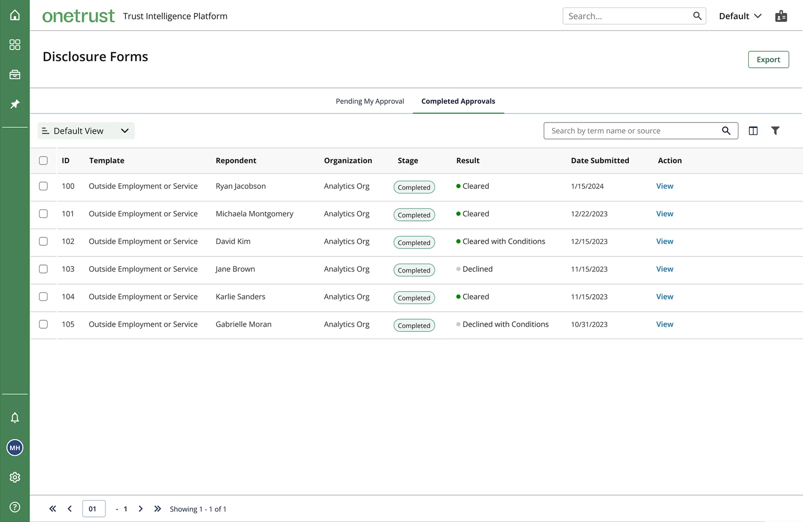
User feedback · Positive, yet constructive
Testing shaped the final details.
Customers found the new view clearer and easier to use. Their concerns went straight into the final design.
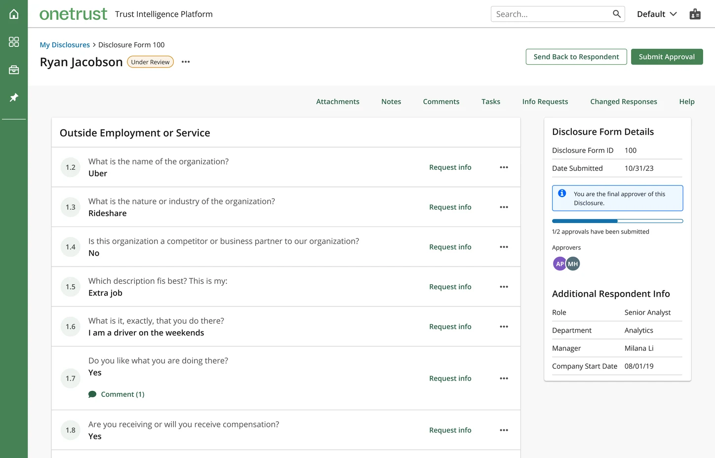 123456
- “Very minimalistic and to the point.”
- “Heaps better! You can see all of the questions easily.”
- “Love the employee summary…[and] the date submitted.”
- “…this UI, is simpler, and easier to digest…”
- “I like how the comment shows up right there.”
- “The sidebar with information is valuable.”
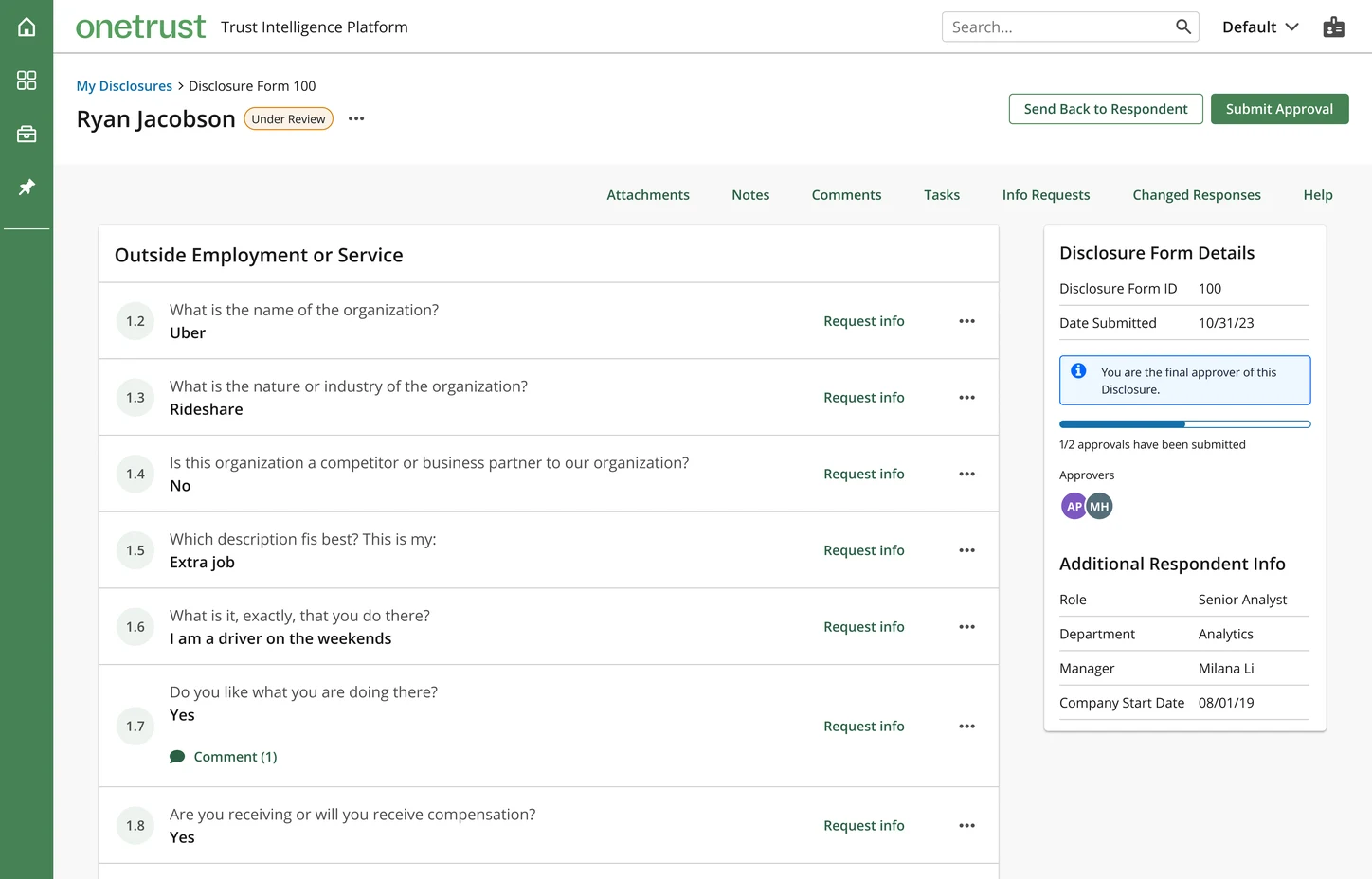 1234
- “Rethink ‘Submit approval’ language… like ‘Finish review’…”
- “I’m not sure what value the number on the left… provides… kind of confusing.”
- “Displaying email address is critical.”
- “I’m curious if we will be able to pull [additional] information…”
From my manager
“Nick is a skilled and thorough researcher… His ability to uncover key user insights has contributed significantly to the success of our team’s projects.”John Langford · UX Manager, OneTrust
What I’d do differently
- Plan research around the calendar. The customer survey stalled over the December holidays, and I had to pivot to internal discovery. Next time I’d start recruiting earlier and line up backup participants
- Measure behavior, not just sentiment. 90% satisfaction shows approvers liked the view. Time to approve and fewer send-backs would show whether the bottleneck actually moved