Impact
One library, built for reporters and ready to scale across OneTrust.
aligned on one cohesive intake flow through bi-weekly workshops I led
Cross-functional
extended inside OneTrust’s design system instead of running Material alongside it
Decision
sizing and breakpoints for modals, which had none before
New definitions
- Ethics and compliance leaders on the advisory board called customizable intake critical for reporter trust
- Advocated launching the responsive foundation first to gather data while AI intake was explored
- Led Speak Up while also driving Disclosure Approval, one of four OneTrust products I designed for
Overview
Reporters needed a safe, fast flow. The system was built for admins.
Led design for the intake flow and the new component library.
Responsive library documented with components and variables.
UX director, 2 designers, researcher, 4 PMs, eng and architecture leads. 4 months.
The problem
Reporters aren’t admins.
Speak Up lets employees of OneTrust’s customers report ethics concerns, from small misunderstandings to fraud or abuse. Reporters are often stressed, rushed and away from a desk. OneTrust’s components were made for dense desktop admin work.

Reassure people the space is safe from retaliation.
People may have minutes. Each step is simple and hard to get lost in.
Many report from a phone or tablet, away from the office.
01 · Extend, don’t adopt
Grow our own system, not a second one.
A new library inside OneTrust’s design system.
Material Design, which the team first considered.
Two component sets mean long-term design debt. Material also limited the branding customers needed.
We gave up Material’s ready-made docs and speed.
02 · Consumer feel, same foundation
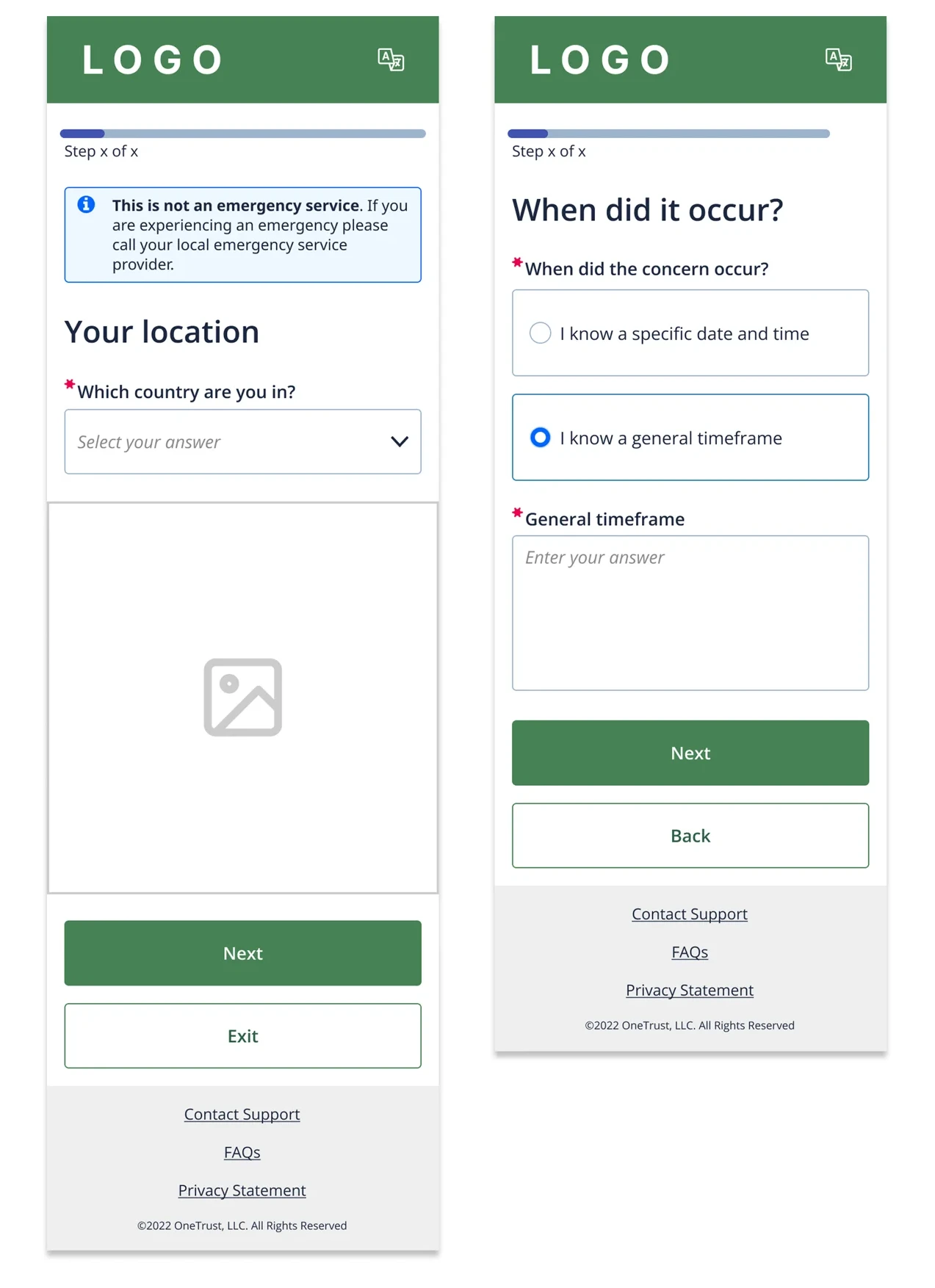
Bigger, softer and brandable.
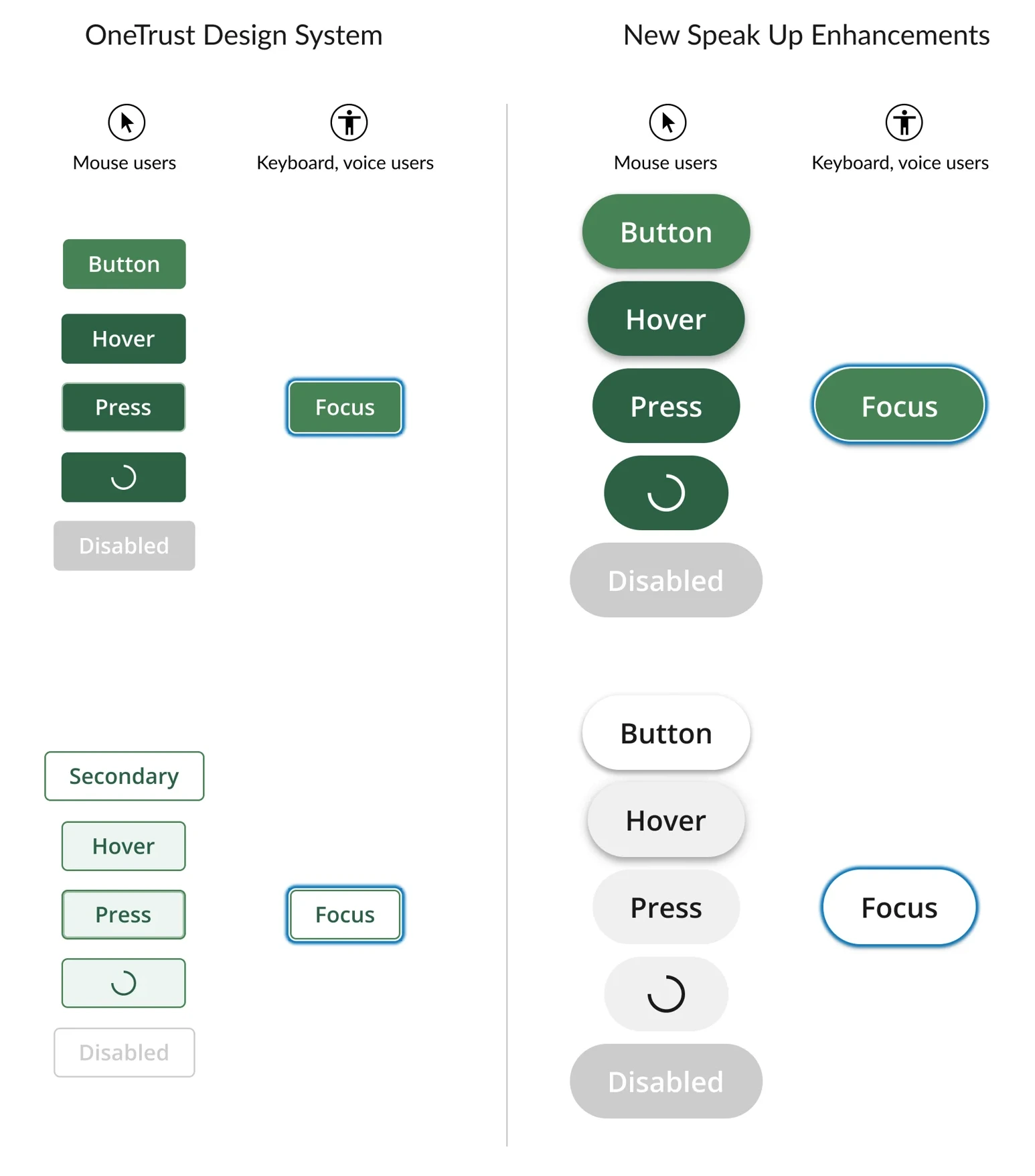
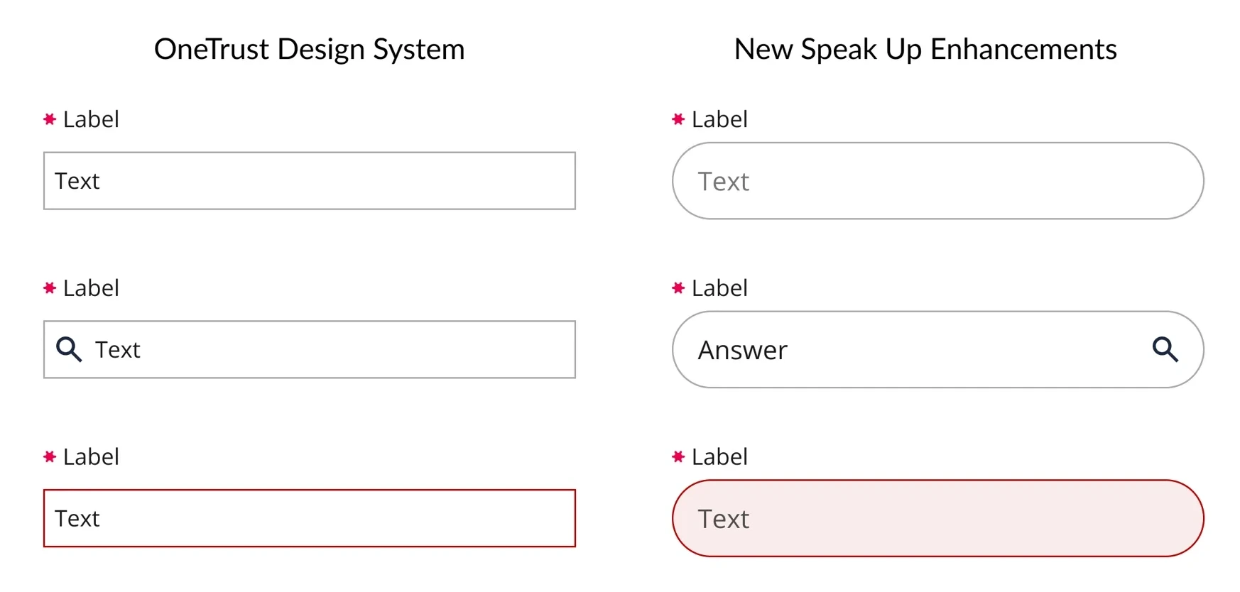
I extended core components instead of replacing them: larger buttons and fields, more padding, and corner radii customers can set. Mouse states and keyboard or voice focus states were designed together.
03 · A new component
Answers that explain themselves.
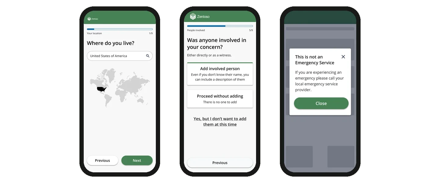
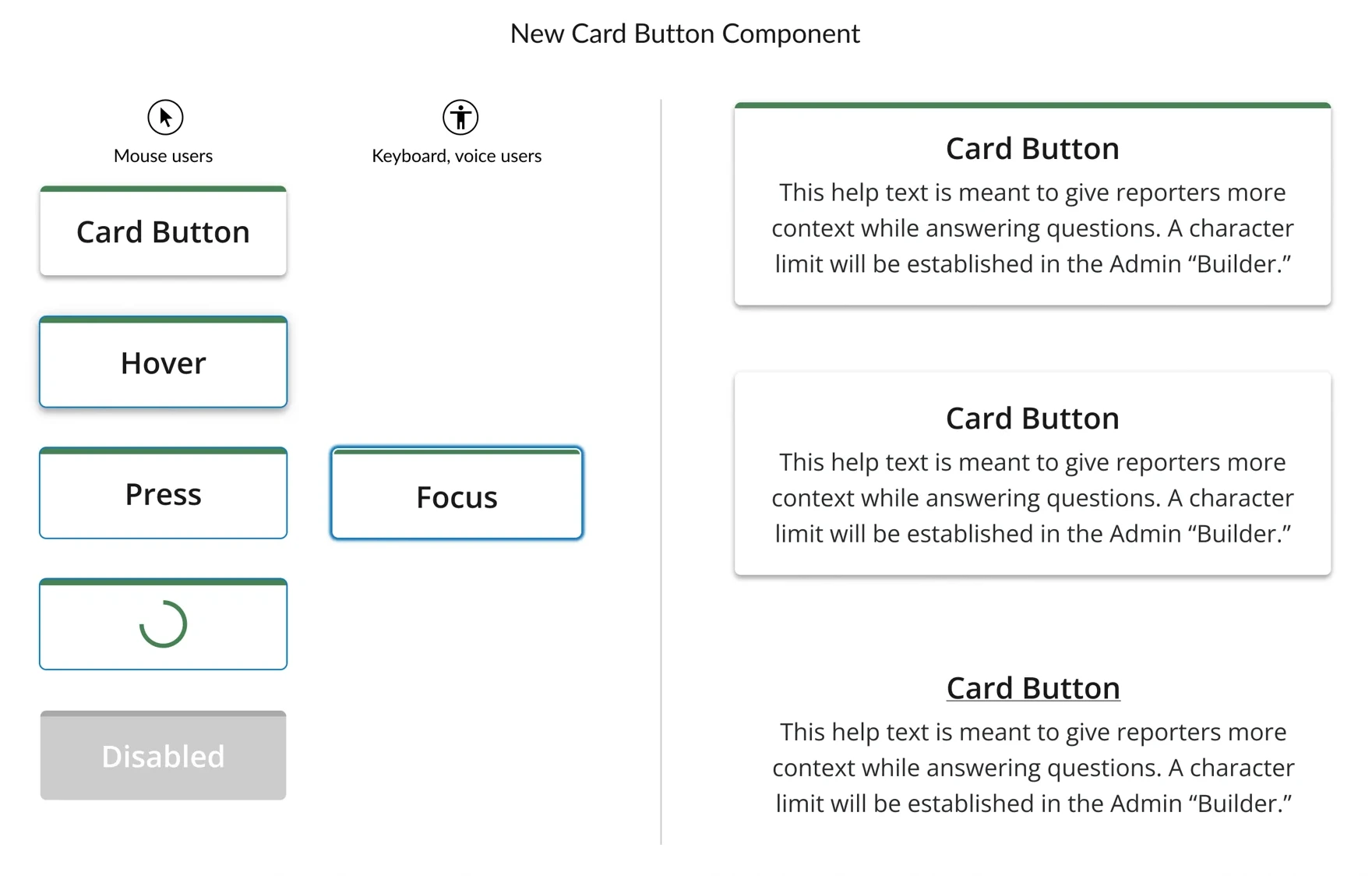
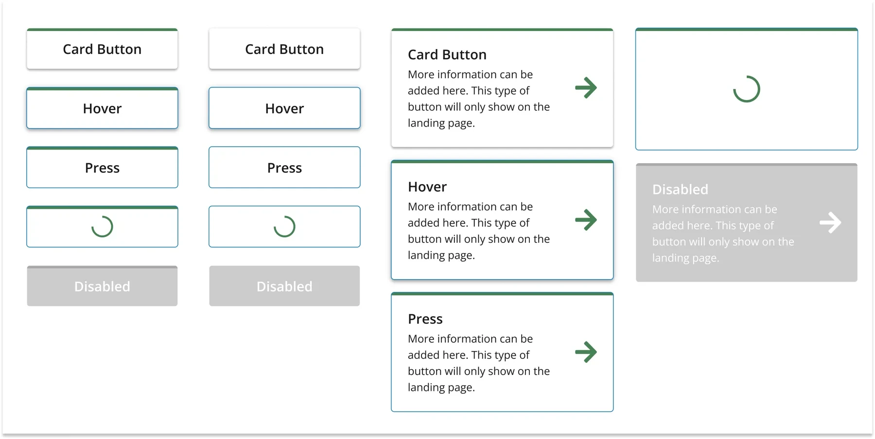
Reporters often need context to choose an answer. I designed a card button with a clear selected state and optional help text that each customer can write.
04 · Responsive by definition
Modals that work on a phone.
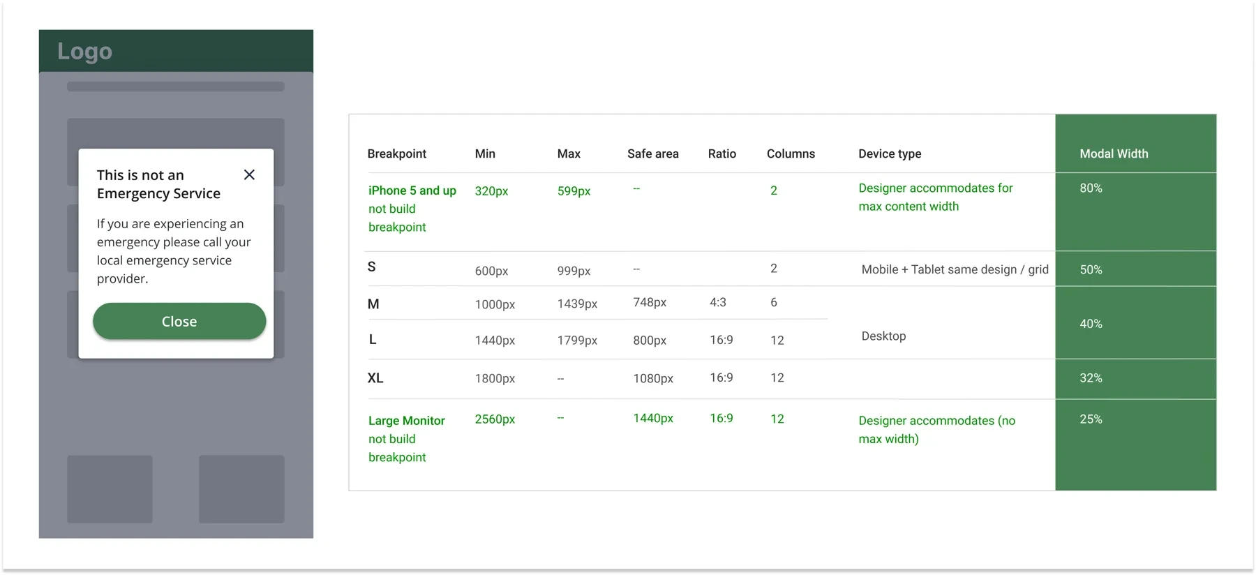
Modals had no responsive rules. I defined sizing, columns and width at each breakpoint, from small phones to large monitors, so engineers had one answer for every screen.
The mobile flow
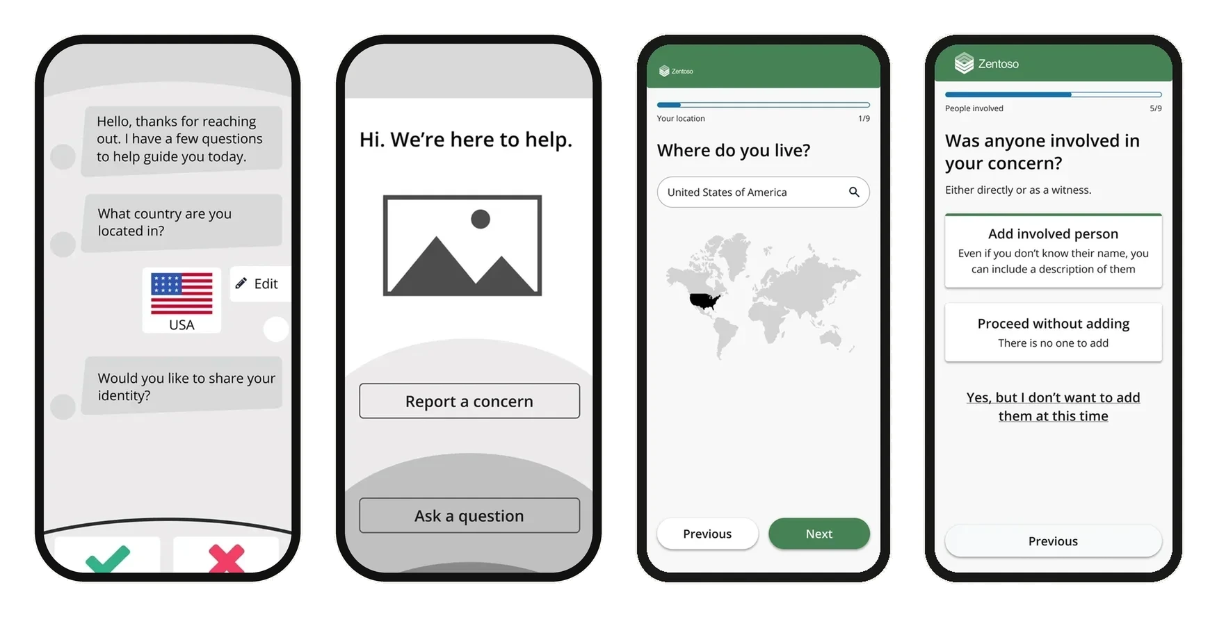
From a chat concept to guided steps.
Early wireframes tried a chat-style flow. The final intake uses one question per step, a progress bar, and the new components.